#developing with brushos
Explore tagged Tumblr posts
Visit Tumblr Blog
Explore Tumblr blogs with no restrictions, modern design and the best experience.
Last Seen Tumblr Blogs


Fun Fact
Celebrities use Tumblr as well.
Text
#experimenting new materials#developing with brushos#for final design#trile and error#dying materials for final design
0 notes
Text

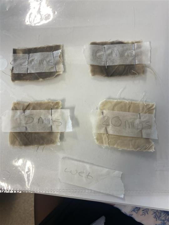


this was my experimentation with different fabric techniques.
bleach timed
the first and second image was my bleach theory. to start it off I set off a timer for 20 minutes and every 5 minutes I took one of each sample out. after 5 minutes you can see that a clear difference was made between the wet and the dry samples. the dry samples took out about more of the colour we can see this from the corner as the corner of the dry wasn't fully submerged which shows a difference
after another 5 mins I took out the next two making sure to wash the samples thoroughly and then left them to dry. looking at the samples they both have similarities however the dry sample tool out a little more than the wet samples
after another 5 minutes I took the other samples out rinsed them and let them dry once they had fully dried you can see that the dry samples have almost no colour after the 15 minutes while the wet samples are still darker
after the full 20minutes the over all colour change was drastic from the full black dye etc and you can see that the dry samples performed a lot better than the wet samples
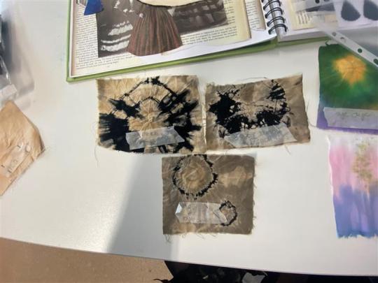
bleach dye
the top two were created by using rubber bands, I tend rubber bands ensuring they were tight. I then dipped them both in bleach then took them out and played them to develop for a few minutes and then rinsed them then removed the rubber bands which left this overall really cool and beautiful pattern which could be cool if in future I add brush colour etc.
the bottom image was created by using buttons, I tied buttons using rubber bands then I dipped them in bleach took it out and left it to develop then rinsed. overall I liked how this turned out it reminded me of the an eclipse which is cool and it would be fun to experiment with different shapes and sizes in the future.
the top left in the 3rd image was created by bubble wrap I used a bigger and smaller size bubble wrap, I applied bleach with a brush and stamped it onto the fabric I also did this with the smaller bubble wrap and left it to dry.
the top right one I created by folding the fabric and used the paint brush to apply bleach then left it to dry
the bottom one was created by using a paint brush and bleach I took a midsized brush and used bleach to paint on these paw print like designs. overall I didn't like how these turned out and could have done better.
tea and coffee
these samples were made by tea and coffee I left each on in there for a few minutes then left them to dry over the space of a couple of days the tea had dyed a lot better than the coffee and the coffee only tinted the fabric.
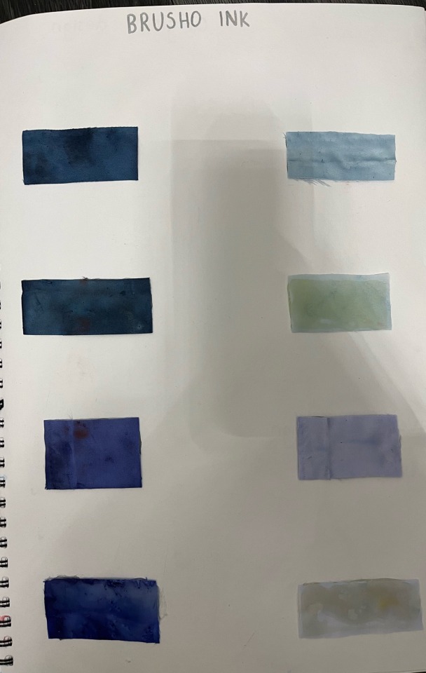
brusho ink
the first brusho ink sample was created by the same technique of tye dye however this used all of my chosen colours i dipped the top in yellow then with a paint brush painted the green, blue then followed by the purple dye. overall i don't like how bold it is it doesn't give a tye dye effect like the other samples do.
the next sample across was created by brusho ink and bubble wrap i painted purple brusho ink onto to a smaller bubble wrap and pressed it onto the fabric i repeated this with the blue however i did this with a larger. i do like the way this turned out and could be an interesting technique going forward.
the next sample was created by using rubber bands. i tied two rubber bands one near the top and one in the middle. i dipped the top of the fabric in green them the middle in purple and then yellow. overall i am happy with how this turned out and with my colour palette it could come in handy when creating something different.
this next sample was created by dip dye, i started off by folding the fabric to make it easier to dip then i dipped it into the purple brusho dye and let it soak for 3-5 seconds then dipped it into the blue brusho dye letting it soak for another 3-5 seconds, overall i liked how this turned out however it didnt fully dry so another sample leaked onto it.
this next sample was created by using buttons and brusho dye i started by using rubber bands to tye around the buttons making ensuring they were tight and secure, then i dipped it into the purple brusho dye, so it wasnt bland i dip dyed blue at the ends to add extra colour, overall i liked how this turned out it had a cool effect in my opinion and loads of these could look better
this last sample was created by using brusho dye i used white cotton and placed rubber bands in the centre ensuring it was tight, i then dipped it into purple dye and created this. overall i was happy with how it turned out, though it wasnt fully dry when i placed it with the other samples and therefore left odd colours which i wasnt a fan of.
little women. (2019). [Film]. United States: Columbia Pictures.
#gowns#fashion photography#fashion design#fashion illustration#fashion marketing#experimentation#brusho ink#bleach
3 notes
·
View notes
Text


POSTCARDS
These are the 6 postcards i made to back up my final garment and pieces, I did a title, final garment and photoshoot, my 6 final designs with the title of my collection, sweet wrappers, development and textiles. I found my postcards really fun to do because i could get quite creative, i used brusho, puff binding and lots of different pages from my sketchbook to make up my postcards and i love how they’ve turned out.
0 notes
Text
Print Development 2
Once again, I love how the symmetry looks, so here I have took inspiration from that. I wanted to experiment with layering and with a bit more texture therefore to Strat the design of I created an inkblot base using brusho ink, in hindsight I should have used regular ink as it was more blue grey rather than black grey. Anyways, from here I layered a variety of different things inspired by different aspects of my project to create a highly layered and textured design. For the centre I incorporated the psychology logo / symbol as it is already symmetrical so it worked quite nicely. Next taking inspiration from nature and symmetry in nature I took a symmetrical flower, the orchid, and spread this out across the design, neat following this floral theme, I incorporated some Art Nouveau line work incorporating little flowers and swirls. Then to finish the design of I wanted to link schizophrenia in in some way, therefore taking inspiration from my initial mood board where I added question marks symbolising the confused state of mind of those with schizophrenia, I added these in to finish it of and fill in gaps. When illustrating this I kind of wanted a psychedelic feel so the areas with a white background where illustrated in black and the areas on the inkblot where illustrated in white to make it stand out more.
As a whole I think this design actually turned out quite nicely, I was skepticle at first as I was unsure if it was too unpolished and the lines weren't that distinguishable however when I scanned it in, it actually worked out really nicely and I love how the illustrations are half white and half black. The only thing is, I'm not a huge fan on how the question marks look as I feel they are just too literal and don't match the vibe of the rest of the design.


INSPIRATION:

0 notes
Text
Samples of construction & Decorative Technique:


Before making my final garment, I had made some samples of construction. I had tested out how the print would look in my chosen fabrics. For the burgundy cotton I was going to use this as my hang over pattern piece. However, the white satin made the print have a bold and clean finish. I had changed my print pattern pieces to all white satin fabric. Due to the burgundy colour cotton did not show my pattern in a strong colour as it had been washed out. I even tried making it on a white background and then adding my print on top but after seeing the results, I decided my best option was the white satin for my pattern. But I had one more attempt to add coloured fabric for my pattern. I tried dyeing the white printed sample using brusho inks as I had tried the white satin, and it left a strong colour after the dyeing process. In conclusion, the stain did dye well but I still thought the print blended into the coloured satin and I continued with the decision of leaving my lotus print to be printed on the white satin. From understanding this I had chosen the colours of my garment and wrote these onto my pattern pieces. For my patterned pieces I had to make some samples for printing my final prints outs especially for my small sized print I wanted for my skirt strips, my back bow, and my lower sleeve. I used some calico to show what the print looked like after rescaling it and adjusting it to what I had envisioned. This process took all day printing out after understanding the measurements and sizes I wanted from using the calico print samples. As I had to use the computer to rescale and place where I wanted the print to be I did have help with my tutor in this process. Before printing I had cut all my fabric out for printing and made arrows to understand which way I wanted them to go, and I ironed these before the printing had begun. Finally, I had made a few samples of construction to use the right thread colour to sew my garment together with making closed seams for my chosen fabrics.
Decorative Technique:
This is showing my final chosen idea for my decorative technique I used for my final garment. I decided to make some hand sewn fabric flowers for my textile piece as I wanted to make some Sakura flowers and after my textile development earlier in my project, I thought these was my best outcome for a clean but effective design for my dress. This process did take a long time to start and finish these, but they gave me the final change I wanted for my dress. I experimented with size as I wanted larger flowers to be along the hem of my skirt between the strips of my final dress. I used a bottle to trace around to make the circle shape as I had to make five circles for one flower as each flower had five petals. After cutting out the circles I folded it in half and half again until it made a quatre and then I sewed along the curve of the quatre circle with a loose running stitch which had around three stitches. I then repeated this for four more circles I had tightened each petal by pulling the thread tighter and then I had sewn my last petal to my first petal to create my cherry blossom flower. Finally, I added a small pearl in the middle to embellish them. I used the same method for both of my large and small flowers. I experimented with different fabrics such as satin, cotton, silk, and calico. I used a mixture of satin and cotton for my flowers. I mixed some pink and white coloured fabric to make some cherry blossoms stand out. I made some plain flowers with burgundy, pink and white. Before I sewed these on my dress, I arranged these in a pattern for my upper sleeve. It did take a long time and a day to sewn on all these fabric flowers. But I am pleased with the result, and it gives my dress its final addition for the completed look I wanted.
0 notes
Text
So this print was inspired by the famous chandelier in Phantom of the opera. It took me absolutely forever to get the shape and design how i liked it. However once i got it perfect, It was really easy to think about how i wanted to lay them out. i loved the first development i created with the four chandeliers in a circle. I think blowing the photo up bigger and adding a lot of colour with brusho ink, and then going in with the sewing machine to add the finer details would look incredible


0 notes
Text
Textile Experimentation- Inks on White Cotton.
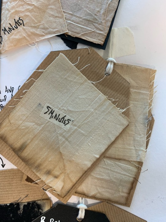

Another experimentation technique I ventured into was looking at using brusho inks onto white cotton using a range of different techniques such as tye-dye with a variety of brusho consistency and rubber band sizes to experiment with different results, pleating and bubble wrap to develop my previous experimentation techniques with bleach whilst incorporating unique textile samples. I really enjoyed constructing different effects with brusho and developing my understanding around brusho as some techniques failed on the first attempt due to the consistency of the brusho and the looseness of my rubber bands which coursed some unwanted bleeding. Much like my bleach black cotton samples, I also experimented with leaving samples of white cotton in both tea and coffee for certain amounts of time to obtain the knowledge on when they both begin to effect the fabric. Repeating theses time durations for 5, 10, 15 and 20 minutes on both coffee and tea I acknowledge that each sample portray the same if not similar styles, which was disappointing. The tea sample has resulted in a more orange finish tone which would be really nice for the era I am working with so therefore I could fined a way to include this technique into my final design. Overall, I really liked experimenting with these techniques, developing my knowledge of brusho and amending and improving my technique to better develop my research.


0 notes
Text


Experimental work produced during Year 1 project 'Botanical'; working from intial paintings experimenting with Brusho powder ink, to produce developed painted pieces on textile (acrylic paint on canvas fabric, and ink on habotai silk, which was then embroidered).
0 notes
Text
Face Development


For my media experimentation I sketched and coloured the faces. However, for my final face designs, I wanted to try something new by using the veins as a continuous line. Therefore, I used the same facial features of my media experimentation faces and merged the style with an illustration I did at the start of this unit. I experimented using fabric paint, however, this did not show as much as I would have liked it to and didn’t look detailed. I chose to use red and blue biro pens as the facial features were clear and created a more clear and defined look. I sketched the faces onto paper first and then onto my final designs.
Experimenting with Dye and Fabric Paint
I experimented different ways to dye my wedding dress fabric. For example, I used fabric paint and brusho inks. I used the lining of the wedding dress and the top layer to see how the dye would affect the two fabrics. However, I will be using the fabric paint for my garment as it is the most vibrant.


1 note
·
View note
Text


TEXTILES
For my main textile pieces, i made a page to show what i’ve done, i developed it with tissue for the background and make moodboards out of my textiles. I’ve done embroidery, pin tucks, appliqué, brusho to dye fabrics and pleating.
I’ve done other textiles like weaving, hand embroidery, adding wadding to fabric i did lots of experimentation to figure out what would be best for my garment and there was also lots of textile experimentation i could do with sweets.
0 notes
Text
Textile Development

Using a secondary image of fungi, I replicated the pattern on the mushroom using batik and brusho ink on calico fabric, brushing the darkest brown at the top of the fabric brushing it all down to the bottom so it would go from light to dark as in a gradient, like the picture portrays. I like this sample as I feel it resembles the pattern on the mushroom in the image well and it could potentially be used as a base fabric for a few designs, which is my main idea.
@barnsleycollegefashionrocks
0 notes


Text
Evaluation
For my Beauty in Mundane Brief, my ideas are shapes found in buildings. I plan to do a series of two layers for Risograph. For the other idea it will be a series of two-layer screen prints of shapes found at the Seaside. The idea that I have chosen was shapes found in buildings. The first Risograph comes out pixelated because when enlarged and the crop the image becomes pixelated. For the second Risograph I used drawings of my local church and the other is of the college building. I got that idea from laying the two drawings on top of each other. I could have done more work if my health was better and was able to be in college. When it was during this brief, I was nearly submitted to different hospitals three times with two different infections.
I used a photo of a band stand that got pixelated, when it was edited for the printing, but it turned out good but not as good as I hoped it would turn out. The other photo I used was a half tone of one collage in Laura’s class. It became pixelated, so I cropped it. I also did RISO graphs of drawings that I did of the church and college buildings. These prints come out better than the building and halftone print. I did one with edits of photos and drawings of buildings for Risograph, I also did the edits using Canva. I did tracings of seaside which added colour by painting it and added details to it with a POSCA pen for my second concept broad. Then I did the other concept broad with photos of drawings that I have done. I have also done two collages using brusho as a background and glue, cutting up photos of the drawings to the background. For my second collage I used Risograph print for a background, I cut around it and glued the photos of the buildings. I have used a different app to create halftone on the collage.
The drawings that I did for development turn out well, but I would like the drawings to come out neater, I could have used a mixture of charcoal and POSCA pen to draw my drawings. I could have done a print of the college of the buildings printed out in a brighter colour, so it could stand out more on the Risograph print. I could have tried different shape frames on the photo to make the prints more interesting. I could draw the line in the drawing a lot neater to make the drawings better. When I was drawn with the charcoal, I wished that I had sprayed them with fixer spray before I knew the details of the drawing to stop the old details from rubbing out I traced the photos on to tracing paper then free handed the bricks on the building. I wish I could have been better at free hand drawing so the details will come out finer.
For my final I used the Risograph print with two layers then glued the monoprint on top of the solid black background.
My strengths and Weakness
Strengths
Can be able to do work well in lockdown and when I’m unwell
Still able to make work with materials I have out at home.
Weakness
The work came out great considering working from home and with materials that I had at hand and being unwell.
Can’t get more developmental print and develop due to not being at college.
1 note
·
View note
Text
Kyo Fish Sample Two:
To develop another sample from using my Kyo fish, I had decided to use a traditional Japanese textile technique which I had found from my research. I wanted to create a textile sample using the technique of silk painting. For my version of silk painting, I had begun using my Kyo fish print and I had place this on a piece of silk. Then I had traced my Kyo fish print with gutta to create an outline for my silk painting. I had to wait for it to dry before I started to add my paint effect. I had used brusho inks to recreate the effect of silk painting as I did not have any silk paints. Therefore, I used inks to recreate this idea I used various shades of reds, oranges, and yellows. I wanted to make these sample look realistic and have the same colours of the original Kyo fish. I had made several shades by mixing some ink colours and watering them down to make a lighter shade. I did decide to make two just in case one was unsuccessful however after trying one it did leave a similar effect of traditional Japanese silk painting. But one area, I could have improved was to add two layers of gutta to stop the brusho ink spreading from the smallest gaps I left but apart from this it left a nice result. I am happy that I am developing several samples to compare the two finished samples from using different techniques as I can use elements or a certain way for my final design. I do prefer this outcome for my Kyo fish sample with the silk paint representation s it gives it a Japanese traditional finish compared to my weaving sample. But I do love them both as both give the Kyo fish iconic samples to support a symbol of Japan.
0 notes
Text
Media expérimentation
For this illustration, I used the media of watercolours to create depth and tone with shading colours and using water to create different shades lighter and darker. I have found watercolour hard to work with but after practice in my other projects I have developed my technique and work in illustration. I used the colours of grey, white, greens and black to match the fruit which inspired this design. This particular design is off a kiwi. This design was inspired by a sample I created of a kiwi I wanted to focus on the colours and shading of a kiwi. I created the seeds using gutta to create the seeds. I used white cotton and used several shades of brusho green to create the kiwi, but interestingly I added a piece of yellow colour for the outside of the kiwi blending the lighter and darker greens of the kiwi together. I do like the skin colour to be plain as the green colour stands out and I still want it to pop. For the hair, I used several shades of yellow again in colour pencils for the blending and shading to create realism. I went over my work in a white pencil to finish it off. After, all the media is applied I used a fine liner pen to outline and enhance the detail and add the thrills to the bottom of the skirt.
0 notes
Text
LACE SAMPLES

For lace I wanted to develop into ways I can utilise the "cute and innocent" appeal of frills with darker undertones, playing with shredding and burning lace- (fun fact, I found out the lace is synthetic- it melts, and melted lace hurts) as well as gathering them with shirring thread, layering with mixed size and colour lace and overall seeing the effects. Synthetic fabrics don't dye well, so my attempt at back with brusho inks turned a blue-ish grey.
0 notes